

Image: Generated via Gemini Nano Banana
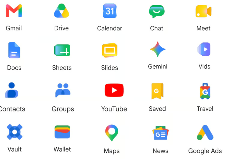
Google’s gradient Workspace icons are rolling out across Android, iOS, and web, giving Gmail, Drive, Docs, Calendar, and more a cleaner look.
Google’s Workspace icons are getting a cleaner look, with redesigned gradient versions now appearing across Android, iOS, and the web.
The refresh affects Gmail, Drive, Docs, Sheets, Slides, Calendar, Chat, Meet, Keep, Tasks, and other apps, starting in Google’s app launcher and some Workspace homepages. The update softens the icons’ colors and makes them easier to tell apart, addressing criticism that Google’s previous Workspace icons looked too similar at a glance.
Google updates its Workspace app icons
The new icons first appeared in the web app launcher in the top-right corner of many Google sites and on Chrome’s New Tab page. 9to5Google said that “everything is more distinct in terms of color and shape,” which is a notable change from Google’s earlier Workspace icon design.
The rollout now extends beyond the web, and the gradient icons are also appearing on iOS and Android.
Android Central noted that the icons are visible in Google’s launcher but have not yet fully replaced older versions in every app. For example, Gmail and Drive may still show older branding within the apps, while the new versions appear in Google’s homepage and in the launcher menu.
The redesign moves away from Google’s stricter four-color approach in favor of softer gradients and more visually distinct icons.
Why the redesign matters for users
Google’s previous Workspace icons drew criticism because many apps shared the same four-color treatment. That made them consistent, but also easier to mix up, especially in browser tabs, app launchers, and mobile home screens.
Engadget described the older icons as having “very little to visually differentiate them” and said the new designs are major improvements for quick recognition.
The refreshed icons also fit Google’s move toward softer gradients and more dimensional design across its products. The timing is notable, as the rollout began just ahead of Google I/O 2026, where the company typically highlights changes across Android, Google services, and AI-powered tools.
More Google coverage
Rollout may take time across platforms
Users should not expect every icon to change at once. Reports show the redesign visible in Google’s app launcher, some Workspace homepages, and mobile apps, while older icons may still appear in editors, favicons, or individual app interfaces.
That staggered rollout is typical for Google product changes across Workspace, Android, iOS, and web platforms.
Read more about the Android 17 rumors shaping up ahead of Google I/O 2026, from Motion Assist and App Bubbles to Gemini updates and Android XR news.
Read the full article here