







Microsoft is giving Copilot a quiet but meaningful redesign, and this time the focus is not just on making it more powerful. It is about making it feel like something that naturally belongs in your workflow.
Across Microsoft 365, Copilot is being reshaped to reduce visual noise and increase usefulness. Instead of constantly demanding attention, it is being designed to sit in the background when needed and step forward only when it actually helps. That shift might sound subtle, but in day-to-day work, it changes how often you feel interrupted versus supported.
A cleaner Copilot that adapts to your intent
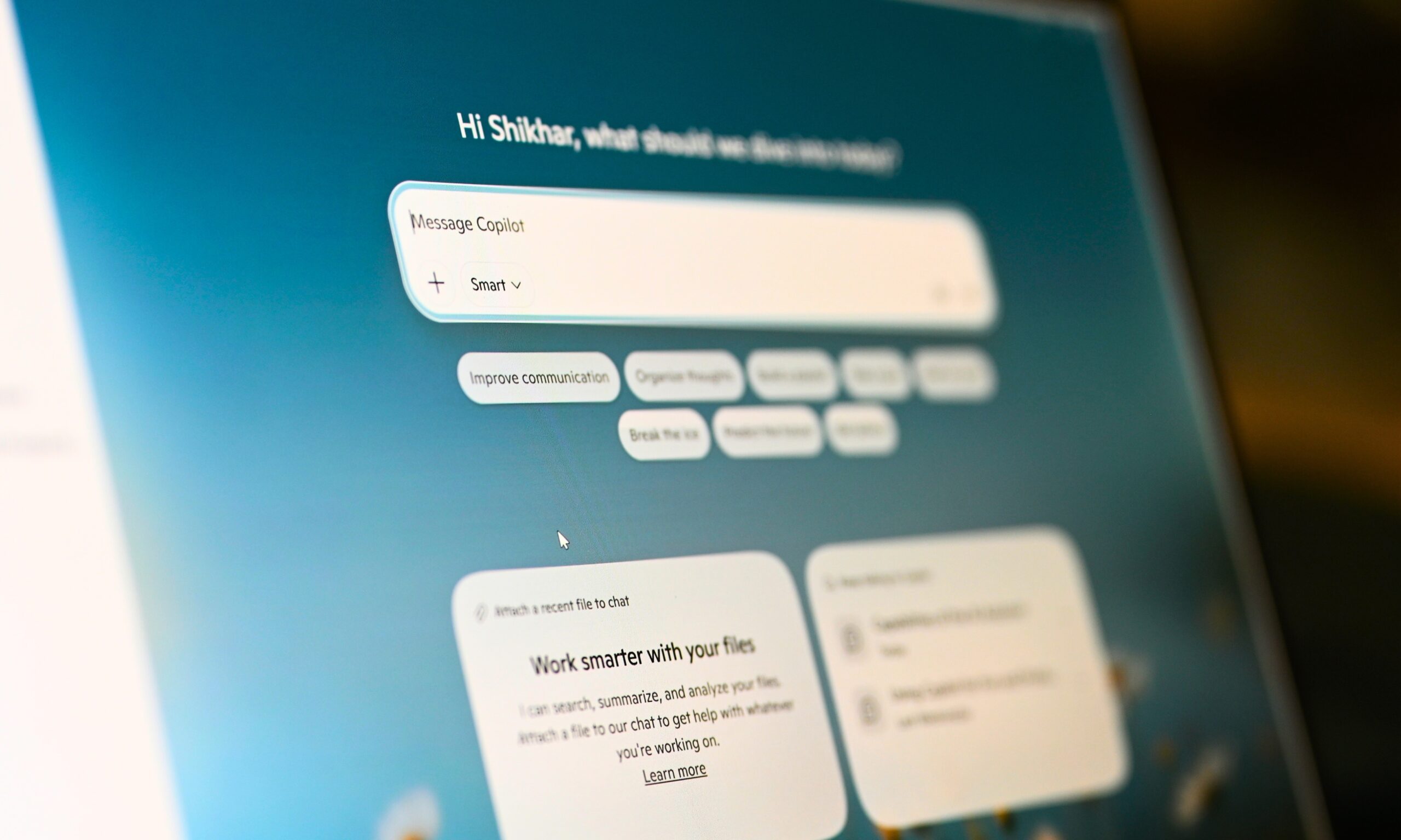
The Copilot app itself has been rebuilt around a simple idea. Work is messy, non-linear, and constantly shifting between tasks, so the interface should not behave like a rigid chatbot window. The most visible change is the prompt area. Instead of a fixed text box that just waits for input, it now expands into a more flexible space where you can write, paste, structure, and refine your request. It feels like shape your thinking before you send it.
Below that, Copilot now surfaces tools and controls based on what you are trying to do. If your task is simple, the interface stays minimal. If it gets complex, more options appear. It is a design choice that reduces clutter while still keeping depth accessible when needed. Navigation has also been simplified. A collapsible side panel makes room for chats, agents, and history without crowding the screen.
Microsoft is also leaning heavily on progressive disclosure, a design approach in which the interface starts simple and reveals more only when necessary. The result is a Copilot experience that feels calmer, even as its capabilities expand beneath the surface.
Copilot is moving closer to your actual work
The bigger shift is not just inside the Copilot app, but across Microsoft 365. Copilot is no longer treated like a separate assistant you open on the side. It is becoming something that moves with you across apps. A single entry point now follows users across Word, Excel, PowerPoint, and Outlook. Instead of asking you to constantly switch contexts, it suggests actions based on what you are already doing. If you are building a presentation, it can help restructure slides or refine content. If you are working in Excel, it can step in when data starts getting overwhelming.
This is where Microsoft’s push toward task-specific agents becomes important. Copilot is being split into more focused roles, such as Designer, Researcher, and app-native assistants in Word, Excel, and PowerPoint. Each one is designed to act like a collaborator that can actually take action inside the document. Even the way Copilot responds has changed. It now starts simple and gradually builds structure. You might see a basic response first, followed by formatting, suggestions, and follow-up actions, if needed. It mirrors how people actually work, starting rough and refining over time.
Underneath this is Microsoft’s context-aware system that draws from emails, files, chats, and meetings. It is meant to understand ongoing work, not just isolated prompts. That means Copilot can better handle situations like long-running projects, performance reviews, or team changes where context matters more than a single question. Microsoft also claims performance improvements, with faster load times and quicker responses, especially for complex prompts.
The bigger shift behind Copilot’s redesign
What Microsoft is really doing here is changing how Copilot fits into work itself. The tool is being positioned as a layer that stays close to your workflow and steps in when needed. That requires a delicate balance. Too present, and it becomes distracting. Too hidden, and it becomes irrelevant. The goal now is to shorten the gap between intention and output. You should be able to move from a rough idea to something usable without constantly translating your intent into prompts or navigating different modes.

There is also a clear shift in design philosophy. Microsoft is moving away from thinking of AI as a feature and toward treating it as an outcome system. The question is no longer what the interface looks like, but whether the result is useful, structured, and trustworthy enough to act on. In that sense, Copilot’s redesign is about restraint. It is trying to stay out of your way without disappearing completely, which is probably the hardest design problem AI tools face right now.
Read the full article here