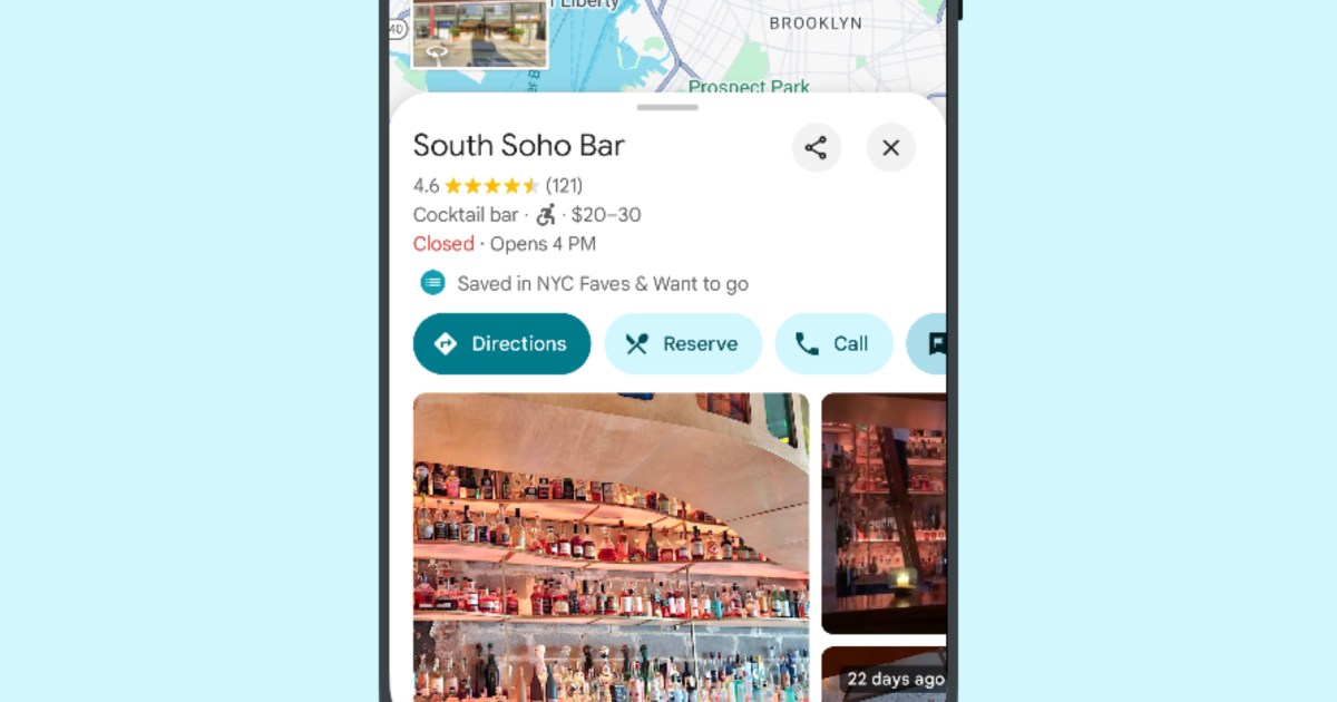
If you own an Android device such as a Samsung Galaxy S24 or Google Pixel 9 Pro, there is a small design update coming to the Google Maps app that aims to enhance its visual appearance and user experience. The app will be adopting a new interface color scheme, which could make navigation and interaction feel fresher.
As first reported by 9to5Google, Google Maps is set to change its signature blue accent for buttons and other user interface elements to a dark shade of teal.
In addition to this color change, text labels within the app will transition from blue to a black hue. This shift may improve readability, particularly in different lighting conditions, and help users focus on the content without the distraction of vibrant colors.
Please enable Javascript to view this content
Blue will also be removed from the app’s floating action button, which typically provides quick access to important features like starting navigation or adding a location.
- 1.
Google Maps old blue accents. - 2.
Google Maps new teal accents.
This color change occurs approximately a year after Google Maps modified the colors of map features like bodies of water and roads. This change faced some initial criticism. More significant changes were made to Google Maps earlier this year when it picked up a cleaner home screen, new pins colors, and a simplified interface.
Keep an eye out for the blue-to-teal Google Maps update, as it could be rolling out soon on your Android device, providing a refreshed look for one of the most widely used navigation apps. If you don’t have it yet, be patient because it’s coming.
Read the full article here


