The world of car infotainment systems is in a bit of a sorry state. While the likes of Tesla and Rivian have developed relatively well-designed and easy-to-use systems, legacy automakers are largely struggling. That, of course, is why Apple’s CarPlay is so popular, as it essentially allows drivers to bypass their built-in infotainment systems in favor of something actually built by a software company.
After driving the new Lincoln Nautilus for a while, I have some hope. Sure, the Nautilus supports CarPlay, and to be very clear, I largely relied on it during the week. But, it also integrates other aspects of software for an overall system that’s actually pretty well-designed.
Is the infotainment system, called the Digital Experience, built into the Lincoln Nautilus perfect? No, far from it. Ford still has a lot of work to do before it can even hope to compete with the likes of Rivian and Tesla. But at the very least, the infotainment system in the Nautilus shows serious improvement.
Big, responsive screens
The core concept behind the Digital Experience infotainment system is that in-vehicle infotainment shouldn’t necessarily be confined to one big tablet-like screen. Instead, in the Lincoln Nautilus, it’s essentially built into two screens.

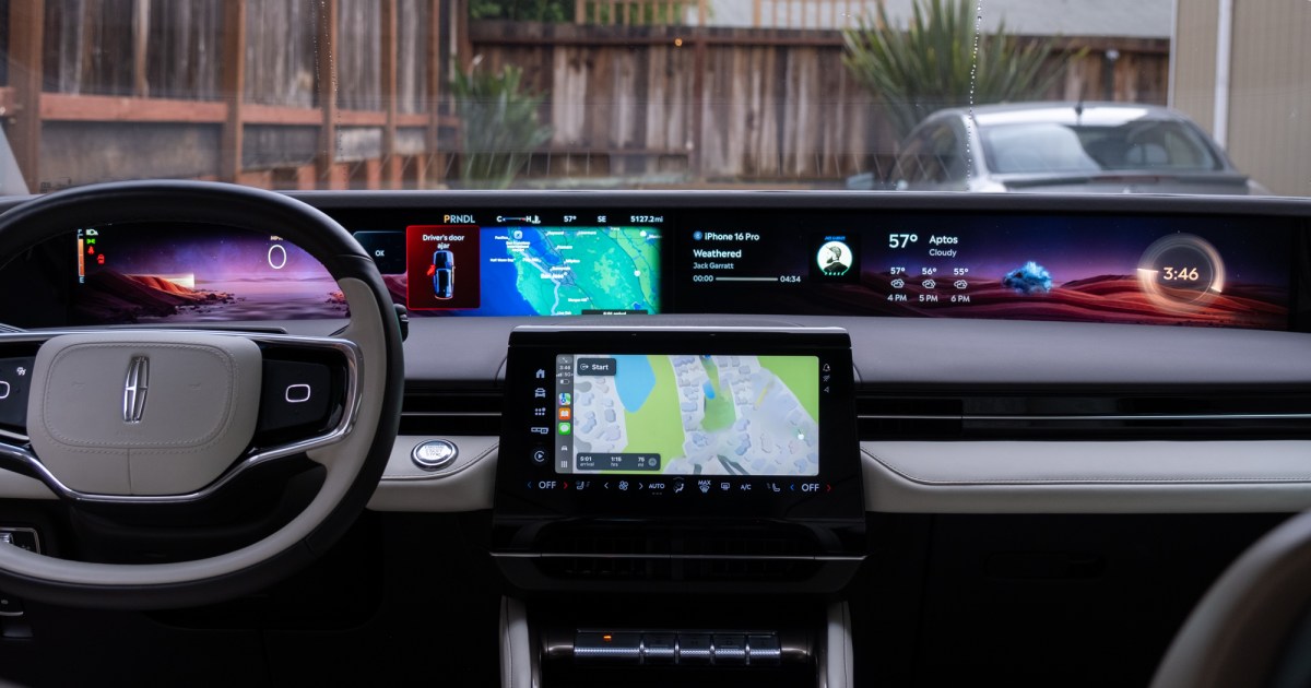
One of those screens is a little different than what you can see in other vehicles right now, though. The main display is a massive curved screen that stretches along the entirety of the dashboard of the car. It encompasses the instrument monitoring screen behind the steering wheel for the driver, but it also shows a range of other information. It’s bright and high-resolution and easy for the driver to see, even when it comes to the information that’s farther to the right of the screen.
Of course, there is still the tablet-like screen in the center of the dashboard, which is the touch display that you’ll use to control the software. Thankfully, the screen is pretty responsive to touch. That’s not necessarily a given when it comes to legacy automakers, which often underpower their software in a way that results in it feeling sluggish and unresponsive. That wasn’t the case here.
Customization is key
Building a great infotainment system, though, has less to do with the hardware and more to do with the software. After all, the Tesla approach is to put a big tablet-like device in the center of the dash, but Tesla drivers still love the infotainment system built into Tesla’s vehicles.

So how is Ford getting around the fact that it isn’t necessarily known for designing great software? Well, through customization, and through awareness about what the different areas of the panoramic display should actually do. The display is divided into three main areas, called “Critical,” “Supportive,” and “Glanceable” zones. Critical information is information that you would normally find on an instrument panel, and this is information that you have limited customization over — like your speed. Supportive information is information directly related to your driving, like any mapping that might be running. The glanceable zone shows information like the weather and the time. This is information that you don’t necessarily need to know as you drive, but it can come in handy.
It’s this glanceable zone over which you have the most control. The glanceable zone itself is actually divided into three of its own zones, which you can add widgets to. You can add information like media, weather, trip information, tire pressure, and more, placed exactly where you want them to be on the right side of the dash display. It worked pretty well, and I really like the concept of being able to only see the information that you actually care about.
Wide integration
For many, even a decent infotainment system won’t replace the need for CarPlay. I am one of those people. I tend to listen to podcasts instead of music when I’m driving, and I use the Podcasts app. So, any infotainment system that might have a service like Spotify built into it still won’t let me listen to my podcasts without resorting to a basic Bluetooth connection. That’s not to mention the fact that my wife and I often use features like the Share ETA feature in Apple Maps to help inform each other when we might be arriving home or at a destination.

The good news is that the Lincoln Nautilus infotainment system integrates very with CarPlay. In fact, through this multi-zone system, you can actually have different aspects of CarPlay displayed on different areas of the screen. By default, the aforementioned supportive zone shows information from Google Maps, which isn’t surprising given the fact that the vehicle has Android Automotive built into it. But when CarPlay is running, it will instead show information from Apple Maps, and it looks great.
It responds to whatever you’re looking at on the main car display screen too. If you have the Maps app open, the mapping area on the main display will instead show an overview of your route along with your expected ETA. If there’s a map running but the Maps app is not open on the smaller touchscreen, then you’ll see a detailed bird’s-eye view like you would see on any CarPlay screen with Maps running.
The integration with CarPlay runs deeper than that too. If you have the media widget in one of the glanceable zones, it will show media information from CarPlay when you have music or podcasts running.
My preferred setup is to have media running on the smaller touchscreen so that I can quickly skip through ads or switch to the next song while having the maps shown on the larger curved display. The setup kind of reminds me of the Dashboard view for CarPlay, but with larger, more-detailed widgets, and with access to more information.

I’m fully cognizant of the fact that I’ve spent half of a discussion about a better infotainment system talking about CarPlay. To be clear, I would be a little frustrated if the Nautilus that I drove didn’t have CarPlay support. But if I weren’t an Apple user and instead relied on Google services, I think I would be perfectly happy without CarPlay, instead using Google Maps logged into my Google account and other services for media.
The rest
Other aspects of the software are pretty good too, though, as mentioned, Ford still has some work to do.
As has become a trend, climate controls are completely packed into the display, but if they have to be built into a display, I think Ford has done so in the best way. That’s because climate controls are always accessible through a menu bar at the bottom of the touchscreen, and everything can be controlled with a single tap. There are arrow buttons persistently available for temperature and fan speed. While you can dive into more detailed menus if you want, the controls that are always present are enough to make quick adjustments as needed with nothing more than a quick glance at the screen.

It’s also helpful that the infotainment system is able to react to different situations so easily. The steering wheel on the Nautilus, for example, has two touch-sensitive D-pads that control different aspects of the vehicle depending on what you’re doing. When you touch one, a small window will pop on the display, showing you what each button does — so these buttons can be a little more versatile, and control more aspects of the software, than they could if they were dedicated buttons for functions like volume.
Hints at the future
There’s plenty about the digital experience in the Lincoln Nautilus that I hope hints toward a better infotainment future, but it’s also important to be realistic. The massive panoramic screen in the vehicle is likely incredibly expensive, and we shouldn’t expect to see something like this on cheaper Ford vehicles in the near future. That said, I think the concept of critical, supportive, and glanceable information has potential, especially if vehicles do adopt a larger multiscreen setup.
On top of that, it’s nice to see automakers finally taking infotainment performance seriously. It’s taken far too long, especially given that sluggish and unresponsive software can be dangerous when it results in the driver having to wait precious seconds for their touch to simply change the temperature in the cabin. Regardless, if other vehicles start being as responsive as the Nautilus, we’ll be in a pretty good place.
Read the full article here


