When Apple announced a big overhaul of the iPhone’s Camera app in iOS 26 back in June, I was very happy indeed. The current app in iOS 18 is a confusing mess, so a redesign was long overdue – and I’ve recently been test-driving the new Camera app in the iOS 26 public beta.
As TechRadar’s former cameras editor, I’ve experienced more than my fair share of annoying interfaces. And while Apple’s current Camera app is far from the worst offender, it does very much feel like my garden shed – with several years of clutter combined with no real attempt at organization.
Well, the good news is that Apple’s definitely rolled up its sleeves and attacked this redesign with relish. The Camera app looks very different, so much so that you’ll initially wonder where it’s tidied everything to. Overall, I’d call it a success so far, but with a few reservations…
The likes
1. The clean minimalism
First, the good news – the new Camera app in iOS 26 is much cleaner and simpler than the old one in iOS 18.
There are now fewer buttons to accidentally press, and the consistency of the Liquid Glass redesign makes everything feel more cohesive and less confusing.
To help reduce accidental taps, Apple has opened up more space around the shutter button. Fortunately, the shutter still supports its usual shortcuts – hold and swipe right to shoot video, or hold and swipe left for burst mode. Fun fact: did you know the latter is called QuickTake, after Apple’s forgotten digital camera?
But perhaps the biggest improvement over the old Camera app are the new Liquid Glass menus…
My least favorite feature of the current Camera app is its Camera Control menu. That’s the one you open by tapping the confusing shortcut arrow at the top of the screen, or by swiping up anywhere in the viewfinder.
Fortunately, Apple has given this a complete overhaul. Gone is the little horizontal row of hieroglyphics for features like Photographic Styles and Night Mode.
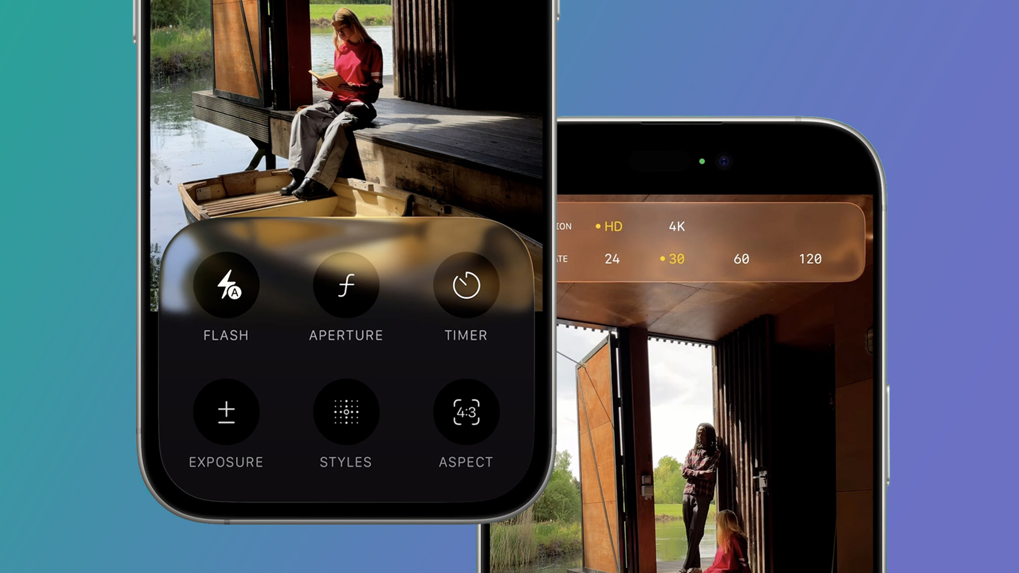
Now, when you swipe up from the bottom of the screen to reveal a much clearer grid of options (housed inside Liquid Glass, naturally), with labels for each. Simply, it’s much better.
Unfortunately, the other big minimalist change – the simple Photo and Video tabs – is slightly less successful, but more on that in the dislikes…
I tend to shoot more photos than video on my iPhone, but I’ve always been frustrated by the fiddly video settings menu in the iOS Camera app.
Luckily, that’s now been fixed in iOS 26. Rather than having to tap the resolution or frame rate several times to scroll through various options, you now get the improved Liquid Glass panel above.
Like in Photo mode, you can swipe up to access separate video options (flash, exposure, and action mode), which are now easier to understand at a glance. The Video experience is still straightforward overall compared to Apple’s Final Cut Camera app, but that makes sense for a point-and-shoot experience.
The dislikes
1. The new nav bar
In theory, I love the simplicity of the new navigation bar at the bottom of the iOS 26 Camera app. It starts with just Video and Photo options visible. To reveal the other modes – Timelapse, Slo-Mo, Cinematic, Portrait, and Pano, to name all of them – you just swipe left or right.
But a couple of niggles have given it a bit of a learning curve. Firstly, the default scrolling setting sees both the Liquid Glass toggle and the navigation bar behind it moving simultaneously, which is a little disorientating. It also makes it difficult to see the options underneath your thumb.
Fortunately, in more recent betas, Apple has added a new option in the Camera Settings in a section called Mode Switching, where you’ll find a toggle for ‘Classic Mode Switching’. This makes it behave more like the previous Camera app, where you’re directly swiping the wheel underneath, while the toggle stays central.
Hopefully, this makes it to the final version of the Camera app. I initially also found it tricky to see the navigation bar options underneath my thumb, but then discovered you can still scroll through them by swiping the screen instead. While minimalism is an improvement overall, I think some will be initially flummoxed and find it trickier to choose some of the photo and video modes.
2. The lack of a Pro mode
I’ve been hoping to see a Pro camera mode come to iPhones for a few years now, but iOS 26 has gone firmly in the other direction. Does that potentially open the door for a photo equivalent of Apple’s free Final Cut Camera app for video? Maybe, but there’s no sign of one of those either.
To be fair, some of the best camera apps like Halide, ProCamera, and Camera Obscura more than adequately fill that gap, and Apple is perhaps wary of Sherlocking them, which is when Apple kills a popular app by building the functionality into its own software.
But if we have a simple Liquid Glass toggle for Video and Photo, why can’t there also be one for Basic and Pro photo modes? That would be a lot easier than switching apps for something like manual focusing, and would turn the iPhone into an even better rival to the best compact cameras.
That still doesn’t look likely, so for now to the best alternative is to set up your iPhone Camera app with some of the useful tools hidden in the settings menu. I typically turn on the Grid and Level, select Apple ProRaw in the Formats section, and then go to Preserve Settings to enable Camera Mode and Exposure Adjustment, making my iPhone behave more like a camera.
But for more tweaks, check out my guide on how to set up your iPhone 16 (or older model) to take great photos.
Read the full article here


