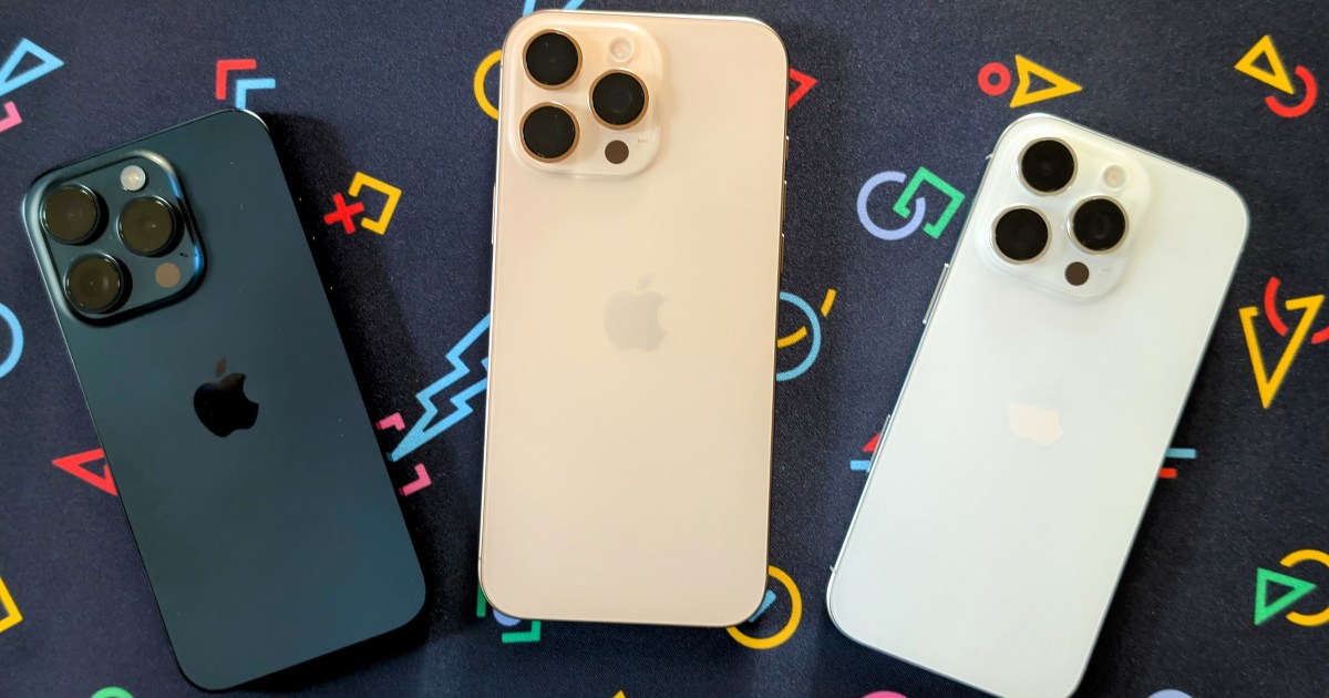
As we’re approaching the end of the year, all the major manufacturers have launched their flagship smartphones, including Apple, which released its iPhone 16 line. While I’ve tried out my fair share of Android phones this year, I’ve continued my annual tradition of purchasing a new iPhone — it simply works best for me due to the ecosystem.
This year, Apple blurred the line even more between the base iPhone 16 and the higher-end iPhone 16 Pro models. I went with the iPhone 16 Pro, mostly because I need the 1TB storage — I’m well past the 512GB threshold.
But if it weren’t for my 1TB requirement, I’m not sure I would have gone with a Pro this year, after years of doing so.
The iPhone 16 Pro design is so boring
Apple went all out this year with the iPhone 16. There’s the bright and bold colors (I adore that pink), the new subtle camera change, a two-year jump in processor power with the A18, and more “Pro” features like the Action button. And Apple even brought the Camera Control to all iPhone 16 models, so you don’t even need the Pro variant to get it.
But then you look at the iPhone 16 Pro, and, besides the Camera Control, it looks pretty much exactly the same as the iPhone 15 Pro. I wanted the iPhone 16 Pro because I need 1TB of storage, and I also wanted the Camera Control and the 5x telephoto lens I missed out on last year.
If it weren’t for these factors, I don’t think I would’ve been interested in the iPhone 16 Pro at all. The overall lack of design changes has made the Pro models a bit boring and stale this year, especially when you consider just how good the base model iPhone 16 is.

And let’s talk about those colors — they’re just about as dull as they come on the iPhone 16 Pro. Black and white are your standard neutral options, followed by Natural Titanium, like last year, and Desert Titanium, which looks like champagne gold. Yeah, I’m not a fan. They’re bland, boring, and hardly different from each other and last year’s colors. I still can’t believe Apple got rid of the Blue Titanium, last year’s best Pro iPhone color.

I adore the new Pink, Teal, and Ultramarine colors for the base iPhone 16. Why couldn’t Apple make good colors like that for the Pro models? Even Google gave us a pale pink Rose Quartz color for the Pixel 9 Pro, which isn’t quite as good as the Peony Pixel 9, but still, at least it’s a pink Pro model! Apple could at least bring back the Rose Gold from the iPhone 6 days.
Camera Control disappoints

Camera Control is one of the big new hardware features of this generation, and it’s not exclusive to the Pro model. But given that I needed 1TB storage and also wanted the 5x telephoto, it was the logical way to go.
Honestly, the Camera Control doesn’t make it any easier to take photos than using the touchscreen. I have found it useful for quickly accessing the Camera app and freeing up my Action button (previously mapped to Camera) for something else.
But the position of the Camera Control makes it a little awkward for me to take landscape photos. Even after adjusting the pressure sensitivity, there’s still going to be more camera shake using that than when using the touchscreen shutter. Even adjusting settings feels faster using the onscreen controls rather than the Camera Control, at least from my experience.
I feel like Apple put Camera Control in the wrong spot. I’ve used it on my iPhone 16 Pro and the iPhone 16 Pro Max that I reviewed, and both require me to adjust how I hold the phone to take a photo. Camera Control should have been lowered a teensy bit toward the bottom, so it’s closer to the edge in landscape orientation. And maybe if it weren’t sitting flush with the frame, it would be easier to press without shaking.
I wish I had gotten the iPhone 16

I’ve seen a lot of folks online talking about how they went with the regular iPhone 16 or iPhone 16 Plus instead of the Pro models after years of using an iPhone Pro. And I’ll be honest — I kind of wish I could have, too.
I’m in love with the pink color, and I think Apple even outdid Google with pink this year. And I’ll admit it — I’ve wanted a true pink iPhone for years. The Teal and Ultramarine colors are pretty amazing, too.
Again, Apple seems to be blurring the lines between the base and Pro models even more. The iPhone 16 has almost all the “Pro” features: A18, an Action button, and Camera Control. The only advantages the Pro models have are more storage, a telephoto camera, a slightly faster chip, and better always-on displays with ProMotion 120Hz refresh rates.
If it weren’t for the fact that I need 1TB storage (I have a lot of photos and apps!) and want the 5x telephoto camera, I probably would have been fine with an iPhone 16. That’s not a position I’ve been in before, but that’s where I’m at with the iPhone 16 family. It’s a testament to just how good the regular iPhone 16 is this year, and how iterative the iPhone 16 Pro is.
Read the full article here


