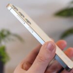
We’re at the tail end of the year, which means that pretty much all the flagship smartphones have now been released. This includes Google’s Pixel 9 Pro and Apple’s iPhone 16 Pro.
Both of these Pro flagships have beautiful designs, powerful processors, and great triple-lens camera systems. But which one takes better photos? Let’s find out.
iPhone 16 Pro vs. Google Pixel 9 Pro: camera specs
Before we look at how the photos from each phone turned out, let’s see how the specs stack up against each other.
| iPhone 16 Pro | Google Pixel 9 Pro | |
| Primary camera | 48MP
f/1.78 |
50MP
f/1.68 |
| Ultrawide camera | 48MP
f/2.2 120-degree FOV |
48MP
f/1.7 123-degree FOV |
| Telephoto camera | 12MP
f/2.8 5x optical zoom |
48MP
f/2.8 5x optical zoom |
| Selfie camera | 12MP
f/1.9 Autofocus |
42MP
f/2.2 Autofocus |
Although both phones have triple-lens setups, the Google Pixel 9 has some key advantages — at least on paper. It has slightly more megapixels for its primary camera, a wider field of view for the ultrawide camera, and higher megapixel counts for the telephoto and selfie cameras.
Does all of that translate to better photos? Let’s take a look.
iPhone 16 Pro vs. Google Pixel 9 Pro: primary camera
The primary camera is the default option whenever you launch the camera, so this is the one that will get the most use. Although Apple uses a fancy new name (Fusion), it’s still the same primary camera as before.
- 1.
iPhone 16 Pro - 2.
Pixel 9 Pro
Let’s start by looking at the back of the Pixar Pier sign at Disney California Adventure. Just with a quick glance, you can tell there’s a stark difference in the image’s overall color — the Pixel 9 Pro version is more vibrant with the signage and the sky, while the iPhone 16 Pro image is a bit darker with more shadows. However, Apple retains some finer details in the texture, such as the minor imperfection on the rightmost large star, which is barely visible on the Pixel. Still, the Pixel 9 Pro produced an overall more pleasing and vibrant photo.
- 1.
iPhone 16 Pro - 2.
Pixel 9 Pro
Here’s a view of the Port of San Fransokyo area at Disney California Adventure. Again, the iPhone image is very heavy on the shadows, making it impossible to see the people under the umbrellas behind the “Port of San Fransokyo” sign. Meanwhile, the Pixel image lets you make out the people there, and with the overall extra brightness, you can see almost everything better. However, the finer details in the bridge pillars appear a tad washed-out due to the lack of contrast with shadows, which the iPhone handled better. The water is also more realistic in the iPhone version, as the Pixel made it appear more green than it is in real life.
- 1.
iPhone 16 Pro - 2.
Pixel 9 Pro
One of the best things about Disney parks is the beautiful flora you can find. Here are some purple prickly pear cactus plants I noticed in Cars Land. The iPhone image came out much better this time around, as the purple color on the cactus is deeper and richer than in the Pixel version. It also did a better job with the texture in the soil, and even the pink blooms around it appear more focused and clear than the Pixel, which looks a bit dull in comparison.
- 1.
iPhone 16 Pro - 2.
Pixel 9 Pro
Who doesn’t like a good burrito? This is one of the new food offerings at Disney California Adventure: a huge carnitas burrito with both red and green sauce. For this one, the iPhone image did better at keeping the plate in focus, as the Pixel image seemed to treat the burrito as the foreground and the chips as the background since they’re blurry. The iPhone has a bit of distortion with the green sauce, but the overall colors are more true to life than with the Pixel.
- 1.
iPhone 16 Pro - 2.
Pixel 9 Pro
This is a bright and beautiful Coco display on the back of a stage area. The iPhone and Pixel handled the colors beautifully, but there’s a subtle difference in tone between them. The iPhone leans a bit warmer, while the Pixel is a tad cooler. But you can’t really notice the difference unless you closely scrutinize them. Some of the flags on the right side of the banner do appear a little washed-out in the iPhone version, but are more vivid with the Pixel. Overall though, both phones handled this scene pretty well, and they’re very close to each other.
- 1.
iPhone 16 Pro - 2.
Pixel 9 Pro
Finally, here’s a photo of a car that caught my attention at a monthly car show in my area. In this scene, the iPhone did a better job of capturing the vibrancy of the red-and-white paint on these two cars. With the Pixel, it’s still a vibrant red, but it looks a bit overly saturated in the middle of the hood, almost like it’s pink. The white car also has a smidge of gray tint compared to the iPhone image. Details in the palm tree leaves in the distance also look better in the iPhone photo, as they are more crisp and clear, while the Pixel appears soft. The same can also be applied to the hood vent grills, which look more focused on the iPhone than the Pixel.
Winner: iPhone 16 Pro
iPhone 16 Pro vs. Google Pixel 9 Pro: ultrawide camera
The ultrawide camera is great for squeezing more of a scene into the frame. This can be particularly helpful for group photos when you have to fit many people into a small scene. The ultrawide camera is also used for macro photos, so we’ll look at how the phones performed there, too. This year, Apple improved the ultrawide camera to 48MP from 12MP, so let’s see how much of a difference it makes.
- 1.
iPhone 16 Pro - 2.
Pixel 9 Pro
You’ll come across this decor when waiting in the queue at Mater’s Jamboree ride in Cars Land. As you can see, there’s quite a difference in the images here. The Pixel photo has brighter colors in terms of the various decorations attached to the wall, but the shipping container-like wall appears washed-out, and there’s a lack of texture compared to the iPhone image. With the iPhone, the wall appears richer with more contrast, and you can see the distressed look on the banners better. The blues and reds also have more contrast, and the wood toward the bottom has more texture.
- 1.
iPhone 16 Pro - 2.
Pixel 9 Pro
Here’s another cool car that I saw at the car show. There’s a bit of overall tonal difference between the images, as the iPhone image has a warmer tone, while the Pixel is a little cooler. But it’s very apparent that the iPhone version does a much better job of keeping detail in the image, as you can see from the texture of the ground, as well as the reflection on the side of the car and even the engine and tires. The Pixel seems to muddle these finer details, making it appear softer.
- 1.
iPhone 16 Pro - 2.
Pixel 9 Pro
Now, let’s take a look at a macro photo. I snapped this macro of a flower’s pistil. The iPhone image is much brighter and clearer, and you can see that the stigmas at the top are focused, though the ones around the edges have a bit of distortion. With the Pixel image, it’s much darker, and the stigmas are blurry and not in focus. Parts of the style (the tube that the stigma is attached to) are a little clearer, but overall, the image has a lot of distortion. The iPhone shot is definitely the winner here.
- 1.
iPhone 16 Pro - 2.
Pixel 9 Pro
Another good macro opportunity is whenever there are water drops on blades of grass. Here, the iPhone 16 Pro has a more washed-out look to the color of the grass, but the image is still in focus with little distortion and blurriness. The water drops are clear and even let you see the texture of the blade of grass it’s on. Regarding the Pixel 9 Pro shot, I prefer the darker color of the grass since it’s more realistic, but the water drops in the front are blurry, and there’s more distortion.
Winner: iPhone 16 Pro
iPhone 16 Pro vs. Google Pixel 9 Pro: telephoto camera
This year, Apple bumped up the telephoto camera on the smaller iPhone 16 Pro to include 5x telephoto, which was missing on last year’s iPhone 15 Pro. This brings it up to par with most of the competition, megapixels aside.
Let’s take a look at this landmark rock formation in Cars Land at Disney California Adventure. Despite the fact that the iPhone 16 Pro only has a 12MP telephoto lens, it does a much better job of capturing the texture and fine details in the rocks compared to the Pixel 9 Pro, which has a 48MP telephoto camera. The Pixel image is a bit softer and smoother in texture, as there is some loss of lines when you examine the rock closely. The iPhone image just has more overall clarity.
- 1.
iPhone 16 Pro - 2.
Pixel 9 Pro
Here’s a 5x shot of a palm tree outside my house. With this one, the Pixel image is a bit brighter, so it’s easier to see the leaves and the orange bits at the bottom. The iPhone image features more contrast and shadows, and the color is more realistic. It’s also sharper, so you can see more of the individual leaves. Though both are similar, I prefer the iPhone image due to the better contrast — the overcast sky looks more washed-out than it really was with the Pixel.
Winner: iPhone 16 Pro
iPhone 16 Pro vs. Google Pixel 9 Pro: lowlight scenes
Smartphones have come a long way in terms of lowlight photography. With features like Night Mode and Night Sight, as well as larger sensors that can capture more light, photos in dim environments can come out beautifully.
- 1.
iPhone 16 Pro - 2.
Pixel 9 Pro
Halloween time at Disney parks is always such a treat with all the decor. One of my favorites is the Oogie Boogie greeting you at the entrance of Disney California Adventure, as it simply looks incredible at night. Here, the iPhone definitely fared better with this scene. Everything is in focus, there’s a nice contrast between the signage and the lights, and noise and grain are minimal. The Pixel image doesn’t look great in comparison with all the noise in the night sky, blown-out lights, lack of contrast, and muddled details.
- 1.
iPhone 16 Pro - 2.
Pixel 9 Pro
You can’t go to Disneyland and not take a photo of the castle — that’s just facts. I took this photo at night from my favorite side view. This is where things get interesting. The iPhone image makes the castle appear very warm, like a golden tone, while the Pixel is a much cooler and almost blue in tone. In fact, the Pixel version looks more like what you would see during the day, and with the night sky lit up, it feels like that the Pixel tried to make it artificially daytime; it’s definitely not true to life. The iPhone version also doesn’t lose details and texture on the castle itself, unlike the Pixel.
- 1.
iPhone 16 Pro - 2.
Pixel 9 Pro
Though we love Halloween, we don’t go all out on the decor like other people, but we do have a few small lights out in our front yard. I snapped this photo of our black cat and ghost lights in front of our house. Again, the iPhone image is warmer than the Pixel, and the overall image appears brighter and sharper. The orange lights on the black cat also don’t appear blown out like in the Pixel version. I do, however, prefer how the Pixel handled the white color for the ghost lights, as that feels more appropriate than the more yellow appearance in the iPhone one.
Winner: iPhone 16 Pro
iPhone 16 Pro vs. Google Pixel 9 Pro: portraits and selfies
These days, people take tons of selfies and portraits to post on social media. Naturally, you want to make sure that those come out good, right? Let’s take a look at how these phones compare in that regard.
- 1.
iPhone 16 Pro - 2.
Pixel 9 Pro
This is a portrait of my husband and our cat. The iPhone 16 Pro image has an overall warmer tone and gets his skin tone accurately, while he appears a bit more red in the Pixel version. The iPhone also does a better job capturing the texture in the hoodie, which seems to have vanished in the Pixel photo. With the iPhone, the colors of the clothing is more true to life, and the edge detection is a lot better. With the Pixel 9 Pro shot, you can see it blurred a bit of my husband’s hair on the right side, and even blurred a bit of the edge of the hoodie. These issues with edge detection don’t occur on the iPhone version.
- 1.
iPhone 16 Pro - 2.
Pixel 9 Pro
I had my husband snap a quick portrait of me, too. Again, the Pixel 9 Pro made my skin a bit redder than it really is, and parts of my shoulder appears blurry and out of focus. Colors are more accurate on the iPhone 16 Pro image, and it seems to handle edge detection better again. The Pixel 9 Pro also gives my skin an airbrushed effect, which looks fake to my eyes.
- 1.
iPhone 16 Pro - 2.
Pixel 9 Pro
Lastly, I snapped a quick selfie here. The Pixel 9 Pro definitely shows the benefit of a slightly larger field of view. For this one, I prefer how the Pixel handled my skin color, as I look more red in the iPhone 16 Pro shot. The colors of my shirt also look more vivid with the Pixel. They’re similar, but due to the coloring, I’m going to have to go with the Pixel here.
Winner: iPhone 16 Pro
iPhone 16 Pro vs. Google Pixel 9 Pro: verdict

There you have it. The iPhone 16 Pro beats the Pixel 9 Pro in all five categories, making this a clear and decisive win for the iPhone. Though the Pixel 9 Pro has been one of my favorite phone releases this year, Apple once again is the better option if you want excellent photos. Though the Pixel 9 Pro has some better specs for the cameras, it’s not always about the numbers.
While I still have some second thoughts about getting an iPhone 16 Pro, the better photos I’ve been getting make me glad I went with the Pro rather than the base model iPhone 16. The 5x telephoto lens is a nice improvement, and with the new generation of Photographic Styles, you can take your iPhone photos to a whole other level. For this camera comparison, though, I kept my style to Standard.
The Pixel 9 Pro doesn’t take bad photos, it’s just the iPhone 16 Pro takes better ones.
Read the full article here


