Apple’s iOS 18 update is a big one. You can tint and change the colors of your app icons, freely place apps/widgets on your home screen, customize your lock screen controls, and more. There’s a lot to dig into.
One of the other big features is the ability to fully customize the Control Center, and admittedly, I’ve largely ignored it since I downloaded the iOS 18 beta months ago. But last Friday after work, I took some time to dive headfirst into the Control Center on my iPhone 16 and completely rearrange it. After about 30 minutes of tinkering with things, I think I created the perfect Control Center setup.
How I set up my Control Center
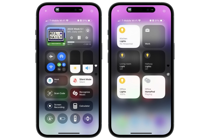
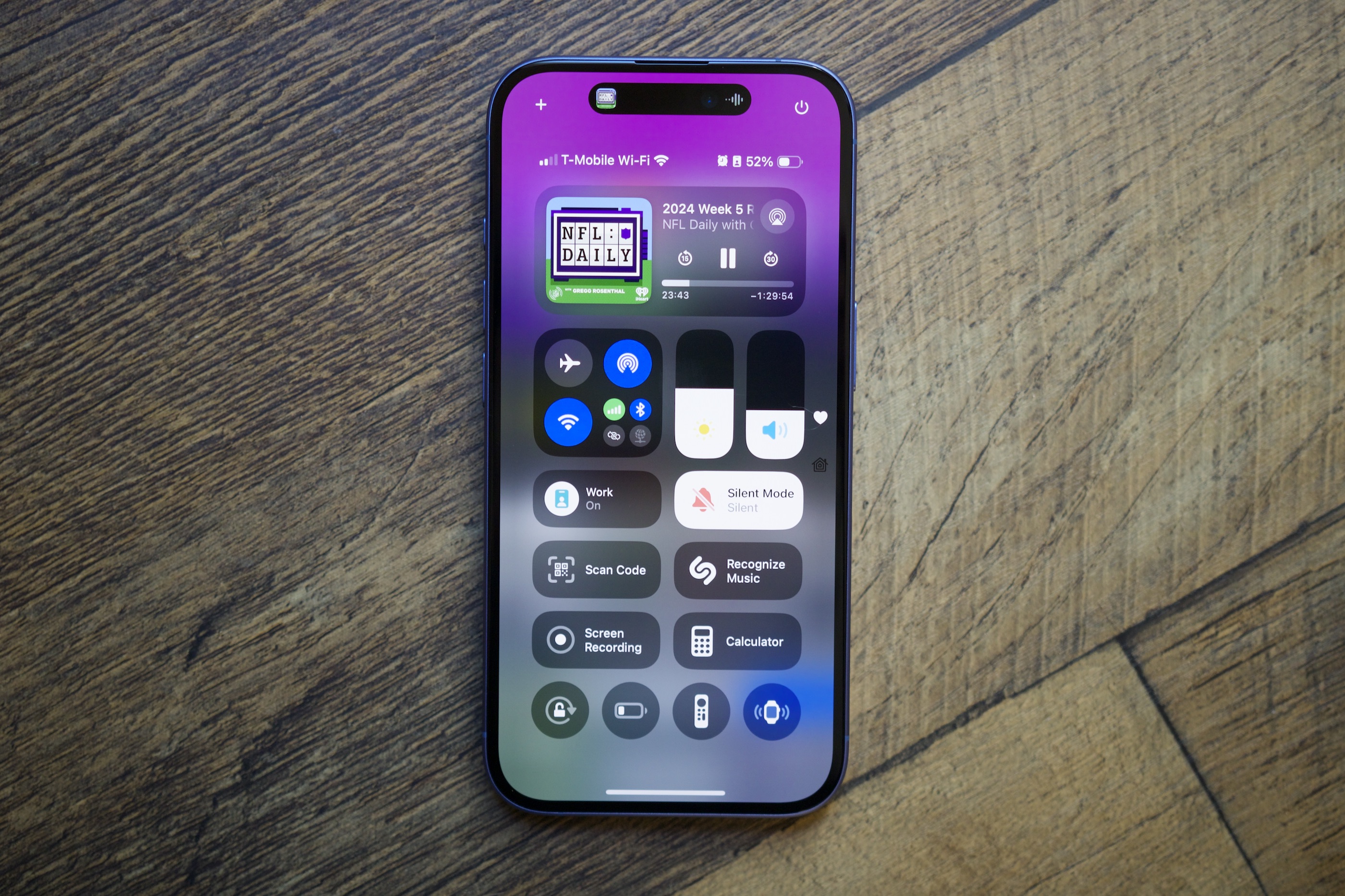
Without further ado, this is my new Control Center. Starting top from bottom, I have the media playback control at the very top and resized to be larger than the small square Apple gives you by default. I like how it prominently highlights the album artwork of whatever I’m listening to, plus the progress bar that shows how much time is left in the song/podcast that’s playing.
Below is the new connectivity control added in iOS 18, with easy access to airplane mode, Wi-Fi, personal hot spot, and more. I know some people don’t like it, but I enjoy being able to tap into the control for additional settings like Bluetooth, VPN, etc. Next to that are brightness and volume sliders, positioned perfectly so I can easily adjust them with my thumb.

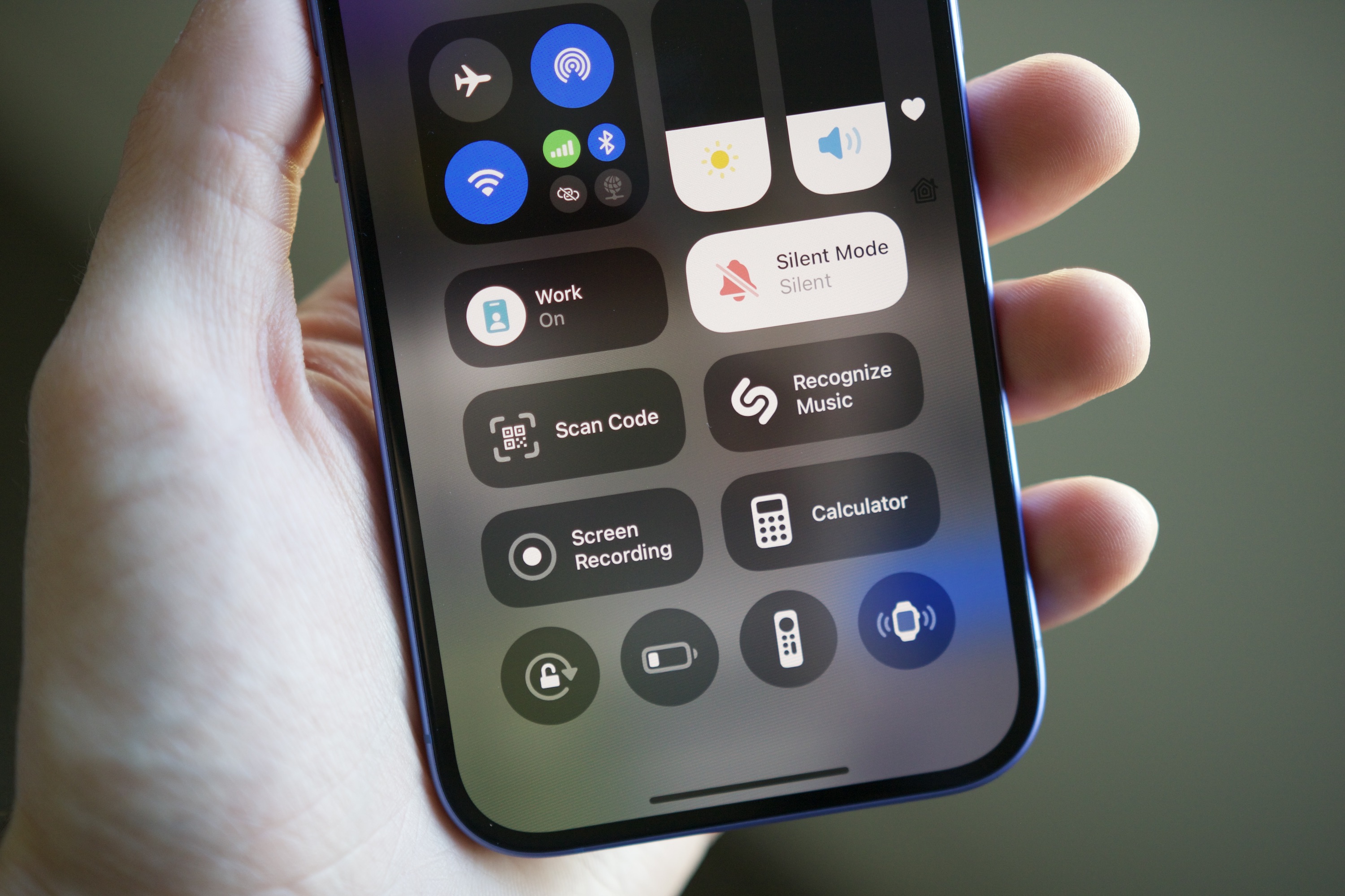
Moving down, we have six of my most used controls, resized to be a bit larger so they’re even easier to tap. I have controls for my Focus modes, ring/silent toggle, QR code scanner, Shazam, screen recorder, and the calculator app.
At the bottom are a few additional controls I don’t use quite as often, but still want access to. These include the screen rotation lock, low power mode, Apple TV remote, and Apple Watch finder. I like having these in my Control Center, but since I use them much less frequently, I have them resized to a small circle.
Finally, all of my smart home controls live on a separate page with a full-screen widget giving me access to everything I need — including individual smart lights, my HomePods, and a Work scene that turns on my office lights and turns off all the other lights in my apartment.
It wasn’t easy getting here

While I love how my Control Center looks, getting it to this point wasn’t easy. As Christine Romero-Chen mentioned in her iOS 18 impressions article last month, the editing process for the Control Center is a mess.
Whenever you move or resize a control in the Control Center, all your other controls automatically move around to accommodate it. However, instead of just moving one space up or to the left, it’s common for multiple controls to go flying all over the screen as if you dropped a grenade on them.
I’m am very very sorry, but iOS 18 Control Centre is the buggiest shit I have ever used 😍
You may have some fun watching me SUFFERING for 1 whole minute 🥰 pic.twitter.com/0BspQNksix
— Into Galaxy 🇺🇦 (@IntoGalaxyy) September 18, 2024
I’ve also encountered numerous instances where controls randomly disappeared after I moved or resized them. There have been other times when I moved a control, but iOS still thinks it’s there, so I have a blank part of the page that I can’t add anything to. It’s incredibly frustrating, and the video above does a great job showing just how bad it is.
Worth your time and patience

I love everything about how I created my Control Center. I listen to a lot of podcasts throughout the day (it’s football season, and I need to keep up with NFL Daily), so having a large and prominent control for media playback is fantastic. A well-placed brightness slider is critical, and larger controls for my most-used features are incredibly handy.
On a more subjective note, I think it’s a visually pleasing setup. It starts with a large control at the top, then differently shaped sliders and the connectivity control hub, followed by a symmetrical row of medium-sized controls and a row of smaller ones at the bottom. You may hate it, but I think it looks excellent.
That’s the best part about iOS 18’s Control Center: You can create it to look however you want. I shared a screenshot of my Control Center setup on Threads and got multiple replies about how other people designed theirs. You could create a slight variation of the setup I made or go with something completely different. It’s entirely up to you, and it’s a level of freedom we seldom see from Apple.
The execution may not be perfect, but if you’re patient and take the time to fine-tune your Control Center exactly how you want it, you can end up with something that works exactly how you prefer. I did that, and it’s now one of my favorite things about my iPhone.
Read the full article here


