
Let me start with the positive – overall, I’m a massive fan of Apple’s new Liquid Glass design language.
I’ve updated my iPhone to iOS 26 and my iPad to iPadOS 26, and I’ve honestly been shocked by how much I dig the new look. Thanks to livelier, more responsive animations and tasteful transparency and parallax effects, Apple’s mobile software feels alive in a way it hasn’t since the skeuomorphic days of iOS 6.
I’m still stunned by the way light refracts through this virtual material – we spend a lot of time navigating UI, so having something beautiful, even inspiring, to look at really makes a difference.
I think something that most reactions to Liquid Glass are missing is that it comes with functional benefits, too.
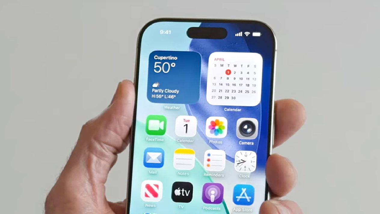
I love the way the Bluetooth connections panel unfolds from the Control Center on iPadOS, instead of taking up the full screen. The Lock Screen keypad now glows when you press it, but also appears much faster if Face ID fails to register. And the glassy toolbars subtly magnify the text underneath the selector. It’s all very neat.
Admittedly, it can be hard to read notifications on some wallpapers, and I won’t try to argue with the reported experiences of vertigo and eye strain. I’ve not experienced any of these side effects myself, but I’m not sure if that’s just luck, or whether I’m worryingly accustomed to looking at screens. If you’re struggling to get used to Liquid Glass, no worries – feel free to check out our guide to toning down iOS 26’s various visual effects.
Still, in general, I think Apple has smashed it. Apple is at its best when it’s blending form and function in creative and intuitive ways, and I think Liquid Glass is a prime example… mostly.
Unfortunately, the praise does end there. Despite how much I love the look and feel of Liquid Glass, there is one change that makes me cringe whenever I look at it – and that happens to be pretty often.
As part of Liquid Glass, Apple seems to have put a refractive filter on nearly every app icon on the Home Screen. It seems that more complex app icons are spared, for now, but for everyday basics like YouTube, Gmail, and Bandcamp, there’s this new soft and glowy layer placed over the top of the icon.
Unlike the rest of Liquid Glass, this blurry one-size-fits-all filter represents Apple at its worst – inaccessible, insubstantial, aestheticizing to a fault, and overly controlling of app developers’ choices. I can’t imagine Google is thrilled about the iconic YouTube logo looking all smudged.
It doesn’t stop there: we can up the ante to a point of true uselessness. Liquid Glass adds the option to change the color of app icons to clear – meaning see-through. I tried this out for a day in the name of science, and found the experience totally bewildering. Even simple icons like Substack and Instagram felt impossible to find amidst the white lines and passed-through wallpaper.
I’ll give Apple a side-eyed pass on the clear icons, as these are very much optional and not on by default – but I can’t see anyone actually enjoying them in daily use, unless you’re a digital minimalist who keeps just a handful of app icons on each screen.
Personally, I’d like an option to disable the new app icon filter, and I’d like it yesterday. More than anything, I want to be able to tell people that iOS 26 is the best-looking software update in recent Apple history – but for now, this one change is holding me back from doing so.
Be sure to check out our full in-depth iPhone 17 review, iPhone 17 Pro review, iPhone 17 Pro Max review, and iPhone 17 Air review – and let us know your thoughts on Liquid Glass in the comments below.
Read the full article here