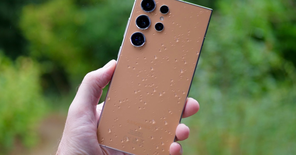
I’ve been using the Samsung Galaxy S24 Ultra again for the last few weeks, and while I do think it continues to be one of the most versatile smartphones around, I quickly got tired of the shape and design.
I wasn’t the only one who had complaints about this aspect either, and it showed me thatSamsung really needs to think seriously about giving the Galaxy S25 Ultra a big boost to increase its appeal next year, particularly because the competition has really improved.
The S24 Ultra is still extremely versatile
I’ll start with the positives. I mean it when I say the Galaxy S24 Ultra is incredibly versatile. It’s right up there with the Google Pixel 9 Pro Fold for me, catering to all my mobile needs in one extremely powerful package. The massive screen is fantastic, so sharp and colorful, and even though I’ve had it permanently set at the top 3120 x 1440 pixel resolution, the battery life has not been dramatically shortened for me.
The Galaxy S24 Ultra’s greatest advantage is its battery life. I’ve been on vacation for a week, so the S24 Ultra’s duties were different from usual. I didn’t use email or Microsoft Teams much, but I spent more time with the camera and apps like Reddit. The battery has lasted about three days without a charge, with around two hours of screen time per day, and it has kept pace with my iPhone 16 Pro Max.
Like most current flagship phones, I’ve never once felt like the S24 Ultra was slow or struggled to cope with multiple tasks, and it’s wonderfully responsive, too. Years of experience with Samsung phones means I can set the One UI software to match my personal preferences in minutes. While I do get a little tired of some system notifications telling me about features I don’t care about, I like the layout and design. However, the less said about Galaxy AI, the better, as I simply haven’t had any reason to use it, and I feel the same way about the S Pen stylus, But both are there for those who may want them.
An old design

There’s so much to the Galaxy S24 Ultra that it’s impossible not to recommend it to someone who wants the most complete, do-anything smartphone in their pocket. However, even though I jazzed my phone up by getting it in orange, the design is really showing its age. It hasn’t changed since the Galaxy S22 Ultra, and a non-techy friend who hadn’t seen the phone before called it “boring” when she saw it on the table next to the iPhone 16 Pro Max.
It made me stop and think about the S24’s design more than I had been doing. There’s no getting away from its simple, slab-like shape and overall flatness. The lack of flourish and character won’t matter to everyone, and the all-business black version will undoubtedly have its fans, but there’s also no getting away from the fact that not much has changed for the Ultra model over the past few years, and it’s not improving with time — especially alongside the fantastic Google Pixel 9 Pro.
Worse is that I’ve really noticed how unforgiving the corners of the phone are. They dig into your palm after a short while and the phone is not as pleasing to hold as the iPhone 16 Plus or iPhone 16 Pro Max. It feels wider and thicker than Apple’s latest phones, even though there’s little difference in physical size, and the sides aren’t very ergonomic. I’ve been spoiled by the new Pixel 9 phones and the iPhone 16 models, which have shone a bright, shameful light on the S24 Ultra’s slippery shape and lack of pleasing tactility.
Much-needed change

Samsung’s decision to keep the same overall Ultra design for a few years now needs to end. The Galaxy S25 Ultra has to compete with Google and Apple’s top phones in terms of in-hand comfort and modern, eye-catching style. If it’s a continuation of the S22 Ultra, S23 Ultra, and S24 Ultra’s look, there’s a risk it’ll be sidelined, especially as Google is clearly taking materials, design, and build more seriously this year.
The rest of the S24 Ultra’s package is so good that it’s hard to see how Samsung could get the technical side of the S25 Ultra wrong. However, while I appreciate the subtle changes it made to the Galaxy Z Fold 6’s shape, not everyone wants to see the same design over and over again. Samsung also made a mistake in changing the Z Flip 5’s excellent design, as the Galaxy Z Flip 6 is nowhere near as nice to hold and use. It’s these things that worry me about how Samsung is going to approach the S25 series, and using the S24 Ultra after the competition has so obviously improved during 2024 has emphasized the effort it needs to put in for the sequel.

Galaxy S25 Ultra design leaks aren’t giving me much confidence, though. An iPhone-like design would be a disappointment, but at least it does look curvier, although the now completely flat sides won’t do much for comfort. At least early information points to the phone being lighter than before, but this won’t be enough of a change on its own.
The Galaxy S24 Ultra hasn’t left me wanting for much, but here’s the takeaway: I’d prefer to put my SIM card in the Pixel 9 Pro Fold or the Pixel 9 Pro than continue using it. This hasn’t happened before and should highlight just how great Google’s phones are this year and how Samsung can’t simply give us more of the same with its next Ultra phone — not when the Android and iOS competition is so strong.
Read the full article here


